
When the word "Wayfinding" is mentioned, the average person tends to not have a clue on what it is.
However, even if you are familiar with wayfinding, the logo is often a forgotten key asset in a wayfinding system.
Good Example of a Wayfinding Logo:
London Underground logo, 1925.
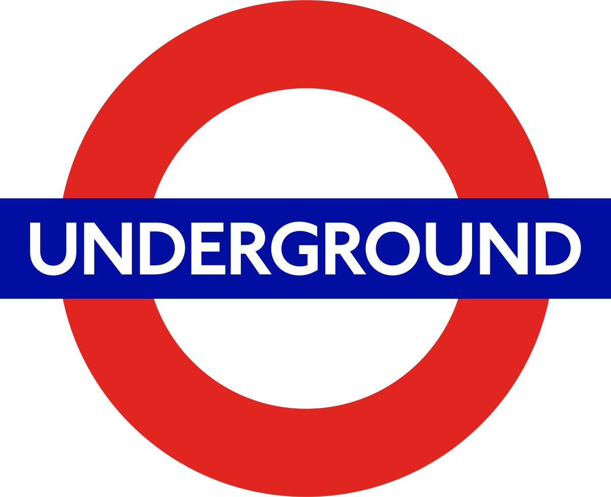

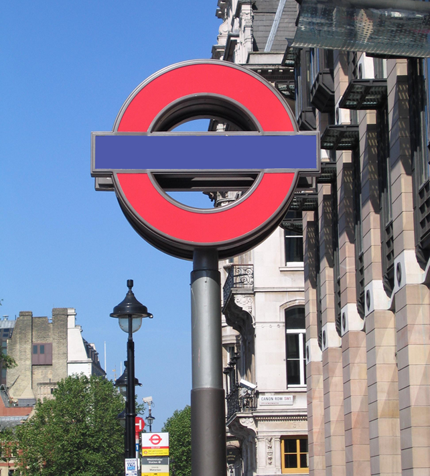

Good for wayfinding because the logo is recognizable under any circumstance.
It works in any colour, any size, any style, and without the text.
––––––––––––––––––––––––––––––––––––––––––––––––––
Bad Example of a Wayfinding Logo:
Toronto Transit Commission (TTC),


Bad for wayfinding because the logo is less flexible.
Only used in red colour palette, appears insignificant at small size, and the text is barely legible.
LEGIBILITY ISSUE???
As a Torontonian or a resident of Ontario, or even a fluent English speaker, the text within "TTC" within the logo doesn't seem to have an issue.
To them, they are used seeing the text within the logo as "TTC".
However, analyze the logo from the perspective of a tourist who isn't fluent in English.
To them, that little cluster of serif letters within the logo may not read as "TTC". They may not be able to break apart the stacked letters into 3 letters.
STILL DON'T SEE WHAT I MEAN?
Compare these two images.
The Chinese character for: Middle


